
☰ Learn Python Tutorial Menu
Charts with matplotlib
Written by Faisal Adnan · Updated 26 Sept 2026 · 5 min read
A textile exporter in Faisalabad used to build its monthly board pack by pasting twelve Excel charts into PowerPoint by hand. Different colours every month, a different y-axis every month, and a director who once asked why sales had "doubled" when the axis had simply moved. Numbers persuade, pictures persuade faster, and inconsistent pictures mislead. matplotlib is Python's standard charting library, and pandas' own .plot() is a thin layer over it. This lesson covers the handful of chart types that carry nearly all business reporting (bar, line, pie, histogram, scatter), how to label them properly, and how to save them for a slide or an email. It's not in the standard library, so run these locally after pip install matplotlib.
Anatomy of a chart
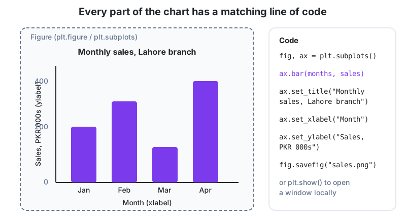
A Figure is the whole canvas. An Axes is one chart inside it (badly named, since it isn't the x and y axis). You draw on the Axes and set its title and labels. Learn the object-oriented style below. The older plt.bar(...) shortcuts do the same thing but get confusing the moment you have two charts in one figure.
import matplotlib.pyplot as plt

months = ["Jan", "Feb", "Mar", "Apr"]
sales = [220, 320, 140, 400]

fig, ax = plt.subplots(figsize=(7, 4))
ax.bar(months, sales, color="#7c3aed")
ax.set_title("Monthly sales, Lahore branch")
ax.set_xlabel("Month")
ax.set_ylabel("Sales, PKR 000s")
fig.tight_layout()
fig.savefig("sales.png", dpi=150)
plt.show()
plt.subplots() returns the figure and one axes. savefig writes a PNG (or PDF, or SVG) for reports, and show() opens a window when you run a script locally. Always call tight_layout(), or your axis labels will be cut off in the saved file and you'll only notice after it's been emailed.
Choosing the right chart
| Question | Chart | Method |
|---|---|---|
| Compare categories (sales by city) | Bar | ax.bar() / ax.barh() |
| Trend over time (daily revenue) | Line | ax.plot() |
| Share of a whole (few categories only) | Pie, or better a bar | ax.pie() |
| Distribution of one variable (order sizes) | Histogram | ax.hist() |
| Relationship between two variables (price vs quantity) | Scatter | ax.scatter() |
A line chart with several series
import matplotlib.pyplot as plt

days = list(range(1, 8))
lahore = [42, 51, 47, 63, 58, 71, 69]
karachi = [55, 49, 60, 58, 72, 80, 77]

fig, ax = plt.subplots(figsize=(7, 4))
ax.plot(days, lahore, marker="o", label="Lahore")
ax.plot(days, karachi, marker="s", label="Karachi")
ax.set_title("Daily orders, first week of September")
ax.set_xlabel("Day")
ax.set_ylabel("Orders")
ax.legend()
ax.grid(alpha=0.3)
fig.tight_layout()
plt.show()
Give every series a label and call ax.legend(). A light grid (alpha controls transparency) helps readers judge values without cluttering the chart.
Horizontal bars for long labels
products = ["Notebook A5", "Ballpoint pen (blue)", "Whiteboard marker", "Stapler HD-10"]
revenue = [125000, 84000, 61000, 23000]

fig, ax = plt.subplots(figsize=(7, 3.5))
ax.barh(products, revenue, color="#ff9820")
ax.invert_yaxis()                                 # largest at the top
for i, v in enumerate(revenue):
    ax.text(v + 2000, i, f"{v:,}", va="center")   # value labels
ax.set_xlabel("Revenue, PKR")
ax.set_title("Top products, Q3")
fig.tight_layout()
plt.show()
Histogram and scatter
import numpy as np
rng = np.random.default_rng(1)
order_values = rng.lognormal(mean=7.5, sigma=0.6, size=1000)     # skewed like real order sizes

fig, (ax1, ax2) = plt.subplots(1, 2, figsize=(10, 4))           # two charts side by side
ax1.hist(order_values, bins=30, color="#22c55e", edgecolor="white")
ax1.set_title("Distribution of order values")
ax1.set_xlabel("PKR")

price = rng.uniform(200, 2000, 60)
qty = 5000 / price + rng.normal(0, 0.5, 60)
ax2.scatter(price, qty, alpha=0.7, color="#f8285a")
ax2.set_title("Price vs quantity sold")
ax2.set_xlabel("Price, PKR")
ax2.set_ylabel("Units")
fig.tight_layout()
plt.show()
plt.subplots(1, 2) creates one row of two axes, each styled on its own. Histograms reveal the skew an average hides. Scatter plots show whether two things move together.
Charts straight from pandas
import pandas as pd
df = pd.DataFrame({"city": ["Lahore", "Multan", "Karachi"], "amount": [7200, 1800, 11800]})
ax = df.set_index("city")["amount"].plot.bar(title="Revenue by city", color="#7c3aed")
ax.set_ylabel("PKR")
ax.figure.tight_layout()
ax.figure.savefig("by_city.png")
df.plot returns an Axes, so every matplotlib method still applies. For quick exploration it's the fastest route. For a chart that's going in front of a client, drop down to the explicit API.
Rules for charts people trust
- The title says what and when. "Revenue by city, Sep 2026", never "Chart 1".
- Label axes with units (PKR, units, %).
- Start bar charts at zero. A truncated axis exaggerates differences, which is how the Faisalabad director got confused.
- Sort bars by value unless the categories have a natural order, like months.
- Use at most five or six colours, with one highlight colour to draw the eye.
- Prefer bars to pies. People compare lengths far better than angles.
The board pack, after: A script reads the month's CSV and produces the same twelve charts through one small helper function, with fixed colours, fixed axis ranges and consistent titles, then saves them as PNGs named by month. The pack takes a few minutes instead of a day, and month-to-month comparisons are finally honest.
The short version
fig, ax = plt.subplots(), then draw with ax.bar, ax.plot, ax.hist or ax.scatter, and label with set_title, set_xlabel and set_ylabel. Bars for categories, lines for time, histograms for distribution, scatter for relationships. Use label plus legend() for several series and subplots(rows, cols) for several charts, call tight_layout() before savefig, and remember that df.plot is matplotlib underneath, so the same styling methods apply.
Homework
- Locally, draw a bar chart of revenue for five cities sorted descending, with value labels above each bar and a title including the month.
- Plot a line chart of two branches' weekly sales over 12 weeks with markers, a legend and a light grid; save it as a PNG at 150 dpi.
- Generate 500 random invoice amounts, draw a histogram, and add a vertical dashed line at the median using
ax.axvline().
Lesson 24 of 26
Sign in to track your progress and earn XP for every lesson you finish.
Practice tip: the built-in code runner is being upgraded. Until it is back, copy the examples into any SQL or Python tool you have (for example SQLite, PostgreSQL, MySQL, SQL Server or a free online editor) and run them there. You can keep reading and earning XP here.